One-Shot Film

{ Posted on 21:30 by Tom 'E' }
When shooting our one shot film the location decision became obvious. We decided to start our shooting at the Co-Op site in Wollaton. The decision was made as it was the location with the most positive aspects and which everyone could locate in order to do the shooting. Whilst on location we tried a number of different ideas, all linked to the different storyboard ideas with a number of different narratives methods and improvisation at times.

After a while it became obvious that the footage was 'OK' however could be better. One member of the team did not show up to the location and as a result the remaining members could all be transported in a single car. As a result we decided to go and try out shooting at the Cossal location.

Most filming's taken on the day went fairly successfully however the move to another location was wise as the best shoot was taken in Cossal.

My edit of the final film is shown below:


As you can see from the embedded YouTube video there are still a number of issues surrounding of the edit - despite being edited fully in a PAL format the size of the video is still incorrect.

All comments welcome, and if anyone knows why this has happened please let me know.

Changing Colours

{ Posted on 00:19 by Tom 'E' }
In todays world of photography it is easier than ever to alter an image in order to provide it with a different sence of meaning. In order to show the meaning of colour within an image I have taken two photos and partialy changed the colours in areas of the image. The image on the left is the original and the image on the right is the edited version.


As you can see from the above images i decided to alter both photos with much warmer colours - both red as a base colour, the top image with a distict tint, the second with almost a pure hue, although it was implemented with some about of shading.

The effects applied to both images change the feeling of the image somewhat. The first image is given a very warm, almost comforting glow by the alteration. Whereas the alteration to the second image has given the photograph a much deeper and sinister look. Two very contrasting impressions whilst using the same colour to edit an image.

Love More by Rebecca Partridge

{ Posted on 00:10 by Tom 'E' }

Love More, the oil painting by Rebecca Partridge, is a very interesting piece of art work with a soul focus on colour, lights and all blends of the two.
The image as a whole is very aesthetic to the human eye. I believe this is down to a number of reasons including the idea of simultaneous growth and graduation. The ‘Nature of Colour’ is made up of four key variations of colour; Hue, Tint, Tone and Shade. However this image uses only half of them, Hue (pure colour) and Tint (colour and white) in order to provide an artistic spectrum of the two.

The centre of the image starts with small cylindrical shapes with a very pure hue of colour to each one – the image seems to expand toward the edges of the page.

As the cylinders get further out they get larger in size and gain greater tint respectively until the edge of the page where the shapes are so large they can hardly be made out.

Also, at the far edges of the image the colour is to the very far end of the tint spectrum and as such it is almost impossible to see what colour or hue the shapes were.

One-Shot Film Story Board

{ Posted on 21:00 by Tom 'E' }
In preperation for the shooting of our one-shot film my group met up, to discuss potential ideas and story themes. After arguing our way through literally some ideas we decided the most plausable for good results would be those we would all be able to edit in our own unique way.

The three final idea's are shown below in the form of storyboards.

The first idea we had was to set the camera up in a building with a fairly open staircase. We intended to place the camera as high up as possible to provide a 'CCTV' type effect.


The second idea is based around the idea of a meeting in a illegal or suspicious sence, the actions are portraid of some sort of 'deal' taking place however no narrative is ever specifies this. The story board for this shown below:


The final idea is that of a meeting in a unwilling sence, a meeting between two strangers in which one is mislead in order to be open to an attack.

Location Scouting

{ Posted on 20:51 by Tom 'E' }
As with any film location is a prime choice and being from Nottingham I took it upon myself to be the location scout for our one-shot film project. Below we're the most likely shooting options:
Sainsbury's, Beeston, Notts:

Pro's: Large Space, many different camrea points, all storyboards could work here
Con's: Strict security, difficult to get to for all members


Cossal Lay-bye Car Park, Cossal, Nottinghamshire


Pro's: Secluded Place, no security issues
Con's: Hard to locate, only work for 2 of 3 storyboard ideas


Tesco, Ilkeston, Derbyshire:

Pro's: Massive space, would work for all storyboard ideas
Con's: Tight security, very busy at all times, hard to locate for team


Ilkeston Retail Park, Ilkeston, Derbyshire

Pro's: Large Space, little security
Con's: Possibly too busy, also hard to locate


Hemlock Stone Pub, Wollaton, Nottingham


Pro's: Easy to locate, would work with all storyboard themes
Con's: Very small area to work with, potential security issues


Co-Op Wollaton, Wollaton, Nottingham

Pro's: Easy to access, large area, would work with all storyboard themes
Con's: Small security risk


Bramcote Park, Bramcote, Nottingham

Pro's: Varied Landscape, 2/3 storyboard themes could apply, large space
Con's: Hard to locate

CRAP Lecture Tasks

{ Posted on 20:10 by Tom 'E' }
CRAP Questions

1. I have recently completed the visual design of a professional website, after working on the site for about 6 months no-one was ever completely satisfied with the look of the site until the number of colours and text types used were limited and unified across most pages. This seemed to be a very effective way to make a much higher quality piece of design. Are there many other ways of using repetition that can drastically improve the quality of design?

2. Alignment - during the slideshow presentation it makes a point of saying that good design should be aligned, it also makes a point of showing that left or right alignment is good, but for an item to be centralised is not good design. I understand the theory but surely on occasion having text centred as opposed to being justified to one side of the screen can have a better impact on an image and the message it portrays?

The Rule of Thirds

{ Posted on 20:47 by Tom 'E' }
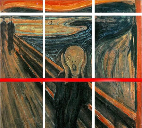
The rule of thirds is a theory which can be subject to any image. The theory states that that if a key element of an image lays upon one of the vertical or horizontal lines it increases the aesthetic properties of the image.

Below is a 5 second film showing how the 'Rule of Thirds' works with one of the worlds most recognisable painting, Edvard Munch's - The Scream.


As you can see from the short clip, and this image;
Scream in Thirds

The main focus of this painting (the 'Scream' figure), is located almost perfectly on the lower horizontal lines, the figure also comes very close to both vertical lines. Due to the physical scale of the image (much higher than it is wide) means that the focus point is close to many lines. I believe that this may add more aesthetic properties to the image. This could also give partial explanation to the fame of this piece.

In theory, any aesthetically pleasing image should use this rule in one way or another. This technique, and others, including the 'Golden Rule' which has a similar theory but uses different methods to view any of the focus points has been used in images that can be traced back over hundreds of years. Many people believe that abiding by these rules is the only way to conceive an aesthetically pleasing image be it painting, photograph, video shot or illustration.