Bring Down IE6!
An interesting campaign by .net magazine.
IE6 also won .net's infamy award this year!
Stephen Fry wins .net magazine award!
Nearly Finished!
Blog Account Change
Not overly interesting to anyone, but just incase you could do with doing the same, this link was really usefull: http://www.bloggertricks.com/2008/02/how-to-transfer-bloggerblogspot-blog.html
Website Update
the non-flashy version im keeping on my main link (ref the previous post) @ http://www.edsonweb.co.uk/wollaton
the dynamic site ive got stored speratly @ http://edsonweb.co.uk/wollaton/withflash.html
Virtually Finished Home Page & Online Progress
please look at the link to see what my home page will look like as well as progress with the rest of the site.
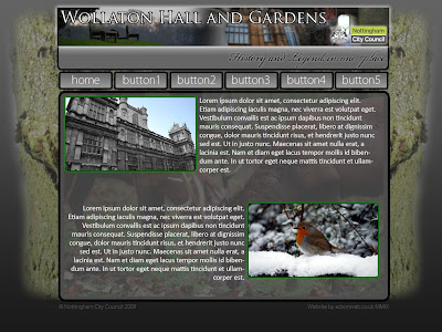
The Final (ish) Design

Ok, so this is the final design i'm going to use for my project, the front page of the site will look pretty much exactly like this bar any minor details that may be changed later on.
Further Designs


Logo Change
 On our logo change task I decided to take a well known logo, with strong connotations, and try and force it in the opposite direction.
The JCB logo, originally has very strong links with the mechanical and physcial industries, as such also has strong suggestions of bulky, manly, masculine and strong appearance.
By changing the main hue to a pinky purple colour, the image is instantly given a more bubbly, fun-looking and feminine feel to the appearance.
Wollaton Park Website Project Update.
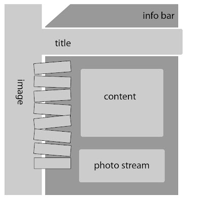
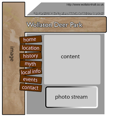
I have created two different wire-frames and mock-up designs for the project, both of which I'm not entirely pleased with, however, the latter of the two I believe will have a larger impact of the aesthetics of the final product.
Wire-frame 1:

Design 1:

Wire-frame 2:

Design 2:
 The second rough design is nowhere near finished (as you can tell), but I thought it would be worth the upload just to give an idea of where I am going with it.
I have not decided what Flash/JavaScript elements I will use yet, however, I have pretty much settled on the idea of using a JavaScript function to create the 'photo stream' on the front page.
Social Network Website Reviews
Review of 3 'User Provided Information' Social-Networking Type Websites
For this review I have decided to review three websites which I currently or have previously used. This way I believe I can provide a better report of user experience having used all of these website for some sort of long-term period, as opposed to just over viewing them briefly for the purpose of this Blog post. The only downside to this is that all the website's I will review are 'forum' based. However I do believe with the exception of the big Social Networking websites i.e. Facebook, MySpace, there are very few specific alternatives without forum-esque layouts.
www.dslruser.co.uk
This website is direct quite specifically at armature, semi-pro and professional photographers, who specifically use DSLR cameras. I started using this site upon purchase of my first DSLR. The website has a friendly approach. Being photography based the general appearance is made up of quite a few very strong and professional looking photographs.
The user account system is fairly comprehensive. They receive their own profile, a mail box and an online photo-gallery section where they can upload their own work. The amount of information available to budding photographers really is endless and very comprehensive. I really like this website!
This is another website I have used a lot in the last year. As a current fiat driver I found this site very useful for querying little things that would usually take a garage hours to respond to, as well as advice on insurance and servicing etc.
As a user experience this works well as there is a massive following, providing a wealth of information on one topic. The only two downsides I can really find for this websites are that it’s aesthetic design is not particularly good. Like many forum based website there is a big feeling of ‘importance’ amongst the longer-subscribed members, which can be a bit daunting when trying to find information and asking questions.
Unfortunately, this website has recently been taken down and this URL now forwards to a similar, although not as impressive website.
The reason I wanted to review this, despite it no longer being ‘live’ is that I really admired the technical and aesthetic design to the website. It was again, forum based. But it made the whole experience feel much more like a general facebook or myspace website by using small widgets to keep the user feeling informed and involved, without having to endlessly respond to posts on the forum. I liked this site a lot and hope it comes back online one day.
Non-Uni Work
My Own Website:
I have a go at designing my own 'space' on the internet atleast once a month, and everytime i go back to it and i don't like it, as such, it never gets made into a full a proper site.
In the last few weeks i've had a couple of ideas flying around i think i might be getting very close to a design i can commit to using for a full website.
The first design i came up with recently was this:
 When i first created this i really liked it. Unfortunatly however, after looking back on it over the next few days i realised that it was probably too load, too bright and a bit of a photoshop disaster.
The second rendition i came up with was this:
 After disliking the previous site design because of its load nature and potentially, slightly 'childish' design i went for something a bit more formal. Unlike the previous design i still really like this. However i don't think it is best suited as a way of advertising myself as an interactive media artist. I believe that it verges a bit too close to being a 'generic' or 'typical' website layout, and as such i don't think it reflects the best of my creative ability. I will however contemplate using it either as the basis of a client project in the future, or purely as an example to show clients to see what sort of thing they're after.
My most recent design for my website is below:
 At present i am really happy with this design. I think it is well balanced in all considered areas of design, from my POV atleast. I have put the image online at 'http://edsonweb.co.uk/vector/' to see how it looks on the internet. Still deciding upon what background to have etc.
Please leave any constructive comments to help me increase my design potential.
As some of you will already know, I do a lot of design and web maintenance work for my Dad's business (something to do with business management). I've currently been producing mock website front pages, logos and other small graphics for them to look at to see what sort of 'image' best reflects them. Some of those that I am most pleased with are below:
New v Old Logo
 Potential new, slightly Web 2.0 style front page:
Business Card-Like Graphic:

That's about all worth showing! =)
Jorunal Task: Review Interviews
Dan Saffer Interview
Looking at this interview had a bit of a disrupted start (the link from the lecture didn’t work!). But after that it got interesting.
This designer clearly knows what he is on about, and is very intellectual. The points from this interview that interested me the most were:
· Knowing the medium
· User-input
· Applied art
· Newbie mistakes
Knowing the medium, in his words, were to explain how you can only do good design, if you are aware of the surrounding design and competition. He also says that we should consider physical design as much of a parallel as digital, and I have to agree. I can’t say that I have ever really thought about it in this way, but after seeing it written down it has become evidently true. Some of the best digital designs you see today have something to do with a physical design form, be it street art or architecture, many of these styles and principles are copied and inspirational to a lot of digital works.
User-input, Saffer believes, can add great quality to a design. After all, they know their business much better than you do, and putting as much user-input into design as possible gives a piece a much higher chance of approval from a client. This is definitely something to remember during any client project.
Applied art, meaning something that is both aesthetic and functional. I think this defiantly one of the most important things to keep in mind when producing websites. One of the website my group presented in class, we thought, was a classic of example of where this had not been taken into account. Creating a website that looks great, with no functional ability, is about as useful as a painting. And a website that works great, but is horribly designed, is about as interesting a dictionary. Website really needs a happy medium to be most effective.
This designers notes on newbie mistakes made me realise some errors I have made, and probably still making today. He explained how it is important to create many different designs for one thing, not just to find one or two and run with those, this is something I cannot deny I am guilty of. The problem is, as he put it, “It is hard to kill your babies, but sometimes you have to.”
Overall a very interesting article, leaving me with a few things to consider in my future approach and designs.
I really couldn’t agree more with what this guy says. When reading the article I found myself constantly nodding my head and thinking “he is absolutely correct”, on many subjects. I found it very interesting when he mentioned using a ‘manuscript’ to plan a website. I’m not entirely sure, in a web-design sense, what a manuscript would contain. Although I am sure this will come to light sooner rather than later.
His opinions on colours schemes, Web 2.0 layouts, and photography are ones I can relate to very easily. When asked “Tell us about your use of colors in your designs.” (Note: American spelling, I assume it’s a Yankey website) He responded by saying he currently prefers a greyscale layout and one other colour. I found this particularly supports my current preference of website colour schemes Even within the last week I have used this thesis on a current project.
Although I’m probably meant to be analysing this from a technical view point, I think this designer has a real likability about him. I enjoyed his comment about his first website; he says his first ever live site is still currently in use. Although he keeps the address to himself. I liked this particularly as it reminds us that everyone has to start somewhere, and that I should probably keep my first websites under my hat as well.
I can’t really agree or praise this designer anymore, so I should probably stop. All I can say is everything he said I already believed, and has in a way, confirmed my thoughts, or has made me realise where I might be going wrong in some basic principle areas.
I have bookmarked this interview, and will be doing some research into this designers work later.
The interviews can be found at:
Dan Saffer: http://www.designinterviews.com/interviews/interaction-design-is-an-applied-art
Joel Schafer: http://www.designinterviews.com/interviews/599
Identities Showcase
Identities Free Choice 1: Website
http://www.edsonweb.co.uk/identitysite2/home/home.html
go check it out. It is a website showcasing some of my photography aswell as photographs that represent me and my life. Its a combination of art and expression to show my identity.
Box Idea


The Final Box Design...

Website
http://www.edsonweb.co.uk/Home.html
Website Element Idea
Initial Design below:

More Logos...

and three others...


Latest Website Idea

Logos
Below are 7 variations of my ideas, please feedback which you prefer, or how i can improove them.

Logo Re-Work

After looking at the above logos several things became evident. These things i feel i need to apply to my own logo. These are:
Logo's should contain no more than two colours, preferably one, usually black
Logo should be can contain text, 'image' part should also be recognised on its own
Using significant letters to create images works well (ie Initials)
Reference to use ie. Mountain outline, road lines, graffiti stencil, waves
To use text, own personal text works, generic fonts probably would not
After looking at these i prepared a few sketches and started to implement them, the first which are below:


Website Reviews
Ferrari Racing Website - Links with logo
Burton Snowboarding Website - Links with avatar
Apple UK Website - Links with personality
The first website, http://www.ferrariworld.com/FWorld/fw/index.jsp, is the part of supercar manufacturer Ferrari's website which they discuss their racing activities. The websites home page, shown below:

The design choices in this website give a lot away about the corporate identity of Ferrari. The using only red and white as base colour gives emphasis on the team colours and a feel of simplicity, tradition and class. The use of the corporate logo, the prancing horse, surrounded by their achievements gives a real impression of success and prestige. Over all the Ferrari website gives a very good impression, which it most definitely intended.
The second website, Burton (seen below), gives a very lively and exciting impression when first viewing. The vast majority of the page is taken up by images, mainly, cartoon snowboarders. The white and light blue colours give it a very cool and crisp feel, which gives connotations of snow. The other two colours mainly used are purple and pink in various shades. These colors give the image a striking appearance and a bold look.
All the images in the website appear to be sketches which also gives a home-made feel to the website. The images are also similar to the style of graffiti artists. This makes the website feel quite urban, despite the obvious links to mountains and nature. The website is definitely geared toward a younger audience.

The third website, Apple UK (as seen below), has a very minimalist approach, to showcase their products which are very much the opposite. The use of cool white and grey colours gives a technological feel, which the company is. The website appears very organised, which could be a reflection on the company's ability to deliver effectively. Over all the website navigates very well and is very aesthetically pleasing.


