Bring Down IE6!
An interesting campaign by .net magazine.
IE6 also won .net's infamy award this year!
Stephen Fry wins .net magazine award!
Nearly Finished!
Blog Account Change
Not overly interesting to anyone, but just incase you could do with doing the same, this link was really usefull: http://www.bloggertricks.com/2008/02/how-to-transfer-bloggerblogspot-blog.html
Website Update
the non-flashy version im keeping on my main link (ref the previous post) @ http://www.edsonweb.co.uk/wollaton
the dynamic site ive got stored speratly @ http://edsonweb.co.uk/wollaton/withflash.html
Virtually Finished Home Page & Online Progress
please look at the link to see what my home page will look like as well as progress with the rest of the site.
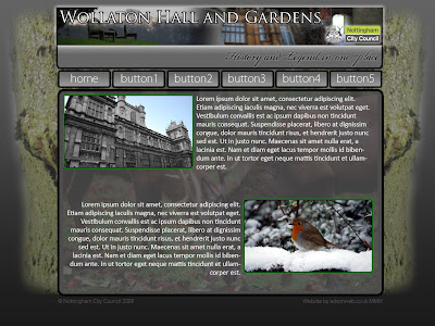
The Final (ish) Design

Ok, so this is the final design i'm going to use for my project, the front page of the site will look pretty much exactly like this bar any minor details that may be changed later on.
Further Designs


Logo Change
 On our logo change task I decided to take a well known logo, with strong connotations, and try and force it in the opposite direction.
The JCB logo, originally has very strong links with the mechanical and physcial industries, as such also has strong suggestions of bulky, manly, masculine and strong appearance.
By changing the main hue to a pinky purple colour, the image is instantly given a more bubbly, fun-looking and feminine feel to the appearance.
Wollaton Park Website Project Update.
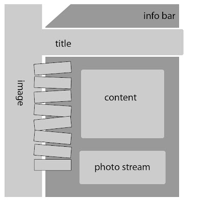
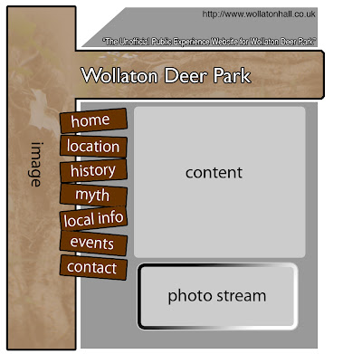
I have created two different wire-frames and mock-up designs for the project, both of which I'm not entirely pleased with, however, the latter of the two I believe will have a larger impact of the aesthetics of the final product.
Wire-frame 1:

Design 1:

Wire-frame 2:

Design 2:
 The second rough design is nowhere near finished (as you can tell), but I thought it would be worth the upload just to give an idea of where I am going with it.
I have not decided what Flash/JavaScript elements I will use yet, however, I have pretty much settled on the idea of using a JavaScript function to create the 'photo stream' on the front page.
Social Network Website Reviews
Review of 3 'User Provided Information' Social-Networking Type Websites
For this review I have decided to review three websites which I currently or have previously used. This way I believe I can provide a better report of user experience having used all of these website for some sort of long-term period, as opposed to just over viewing them briefly for the purpose of this Blog post. The only downside to this is that all the website's I will review are 'forum' based. However I do believe with the exception of the big Social Networking websites i.e. Facebook, MySpace, there are very few specific alternatives without forum-esque layouts.
www.dslruser.co.uk
This website is direct quite specifically at armature, semi-pro and professional photographers, who specifically use DSLR cameras. I started using this site upon purchase of my first DSLR. The website has a friendly approach. Being photography based the general appearance is made up of quite a few very strong and professional looking photographs.
The user account system is fairly comprehensive. They receive their own profile, a mail box and an online photo-gallery section where they can upload their own work. The amount of information available to budding photographers really is endless and very comprehensive. I really like this website!
This is another website I have used a lot in the last year. As a current fiat driver I found this site very useful for querying little things that would usually take a garage hours to respond to, as well as advice on insurance and servicing etc.
As a user experience this works well as there is a massive following, providing a wealth of information on one topic. The only two downsides I can really find for this websites are that it’s aesthetic design is not particularly good. Like many forum based website there is a big feeling of ‘importance’ amongst the longer-subscribed members, which can be a bit daunting when trying to find information and asking questions.
Unfortunately, this website has recently been taken down and this URL now forwards to a similar, although not as impressive website.
The reason I wanted to review this, despite it no longer being ‘live’ is that I really admired the technical and aesthetic design to the website. It was again, forum based. But it made the whole experience feel much more like a general facebook or myspace website by using small widgets to keep the user feeling informed and involved, without having to endlessly respond to posts on the forum. I liked this site a lot and hope it comes back online one day.


